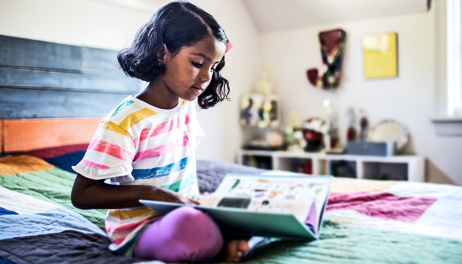
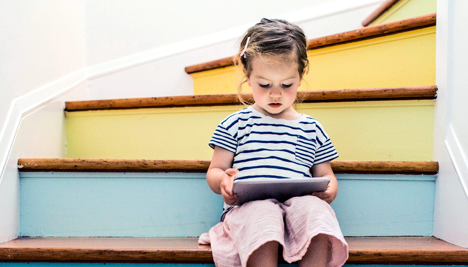
An overly busy page with extraneous images can draw the reader’s attention away from text, resulting in lower understanding of content for beginning readers, according to a new study.
Reading is the gateway for learning, but one-third of elementary school students in the United States do not read at grade level.
“Learning to read is hard work for many kids,” says Anna Fisher, associate professor of psychology at Carnegie Mellon University and senior author of the new paper in npj Science of Learning.
The typical design of books for beginning readers often include engaging and colorful illustrations to help define the characters and setting of the story, offer context for the text, and motivate young readers.
Fisher and first author Cassondra Eng, a doctoral candidate in the psychology department, hypothesized that the extraneous images may draw the reader’s eyes away from the text and disrupt the focus necessary to understand the story.
The researchers wanted to understand how to support young readers and optimize their experience as they become more fluent readers. In the study, they asked 60 first- and second-grade students from the greater Pittsburgh area to read from a commercially available book designed for reading practice in this age group.
Half of the book consisted of the published design and the other half was streamlined, without extraneous images. Each child read from the same book. The team used a portable eye-tracker to monitor the number of times the child’s gaze shifted away from the text to images on the page.
To develop the streamlined version of the book, the researchers had a group of adults identify relevant images to the text. To differentiate, they defined extraneous images as entertaining, but nonessential pictures to understand the story. For the streamlined version, the researchers kept the images that 90% of the adult participants agreed were relevant illustrations. They removed all other illustrations.
While the time each child spent on a page was similar, the researchers found that nearly all children reading the streamlined version had lower gaze shifts away from text and higher reading comprehension scores compared to the text in the commercially designed version of the book.
In particular, children more prone to look away from text benefited the most from the streamlined version of the book.
“During these primary school years, children are in a transition period in which they are increasingly expected to read independently, but even more so in the wake of stay-at-home orders as children are using technology with less in-person guidance from teachers,” says Eng.
“This is exciting because we can design materials grounded in learning theories that can be most helpful to children and enrich their experiences with technology.”
The findings highlight ways to improve the design of educational materials, especially for beginning readers, Fisher says. Simply limiting extraneous illustrations, can help children have an easier time focusing and better reading comprehension as a result.
“This is not a silver bullet and will not solve all challenges in learning to read,” she says. “But if we can take steps to make practicing reading a little bit easier and reduce some of the barriers, we [can help children] engage with the printed material and derive enjoyment from this activity.”
Additional coauthors are from the University of Maryland. The National Science Foundation and the US Department of Education funded the work.
Source: Carnegie Mellon University


